Karma Books Desktop Redesign
Karma Books is an art gallery bookstore in New York City. They want to grow their business by providing a better customer experience.
Timeline
2 weeks
My Role
User research
Visual design
UI design
Prototyping
SUMMARYIn this project, I bridged my interest in art with a customer-centric product
MY APPROACHI started with two questions:
How could a smaller bookseller compete with online e-commerce giants like Amazon?
Could I maintain the elegant, simple look & feel of Karma Books, while delivering better UX?
DESIGN THINKINGPROBLEMKarma Books’ current website looks great however, the navigation of the site is confusing due to the lack of CTA prompts and overall visual hierarchy.
SOLUTIONIntuitive navigation
Adding new features
Engaging content
Fine-tuning the check-out process
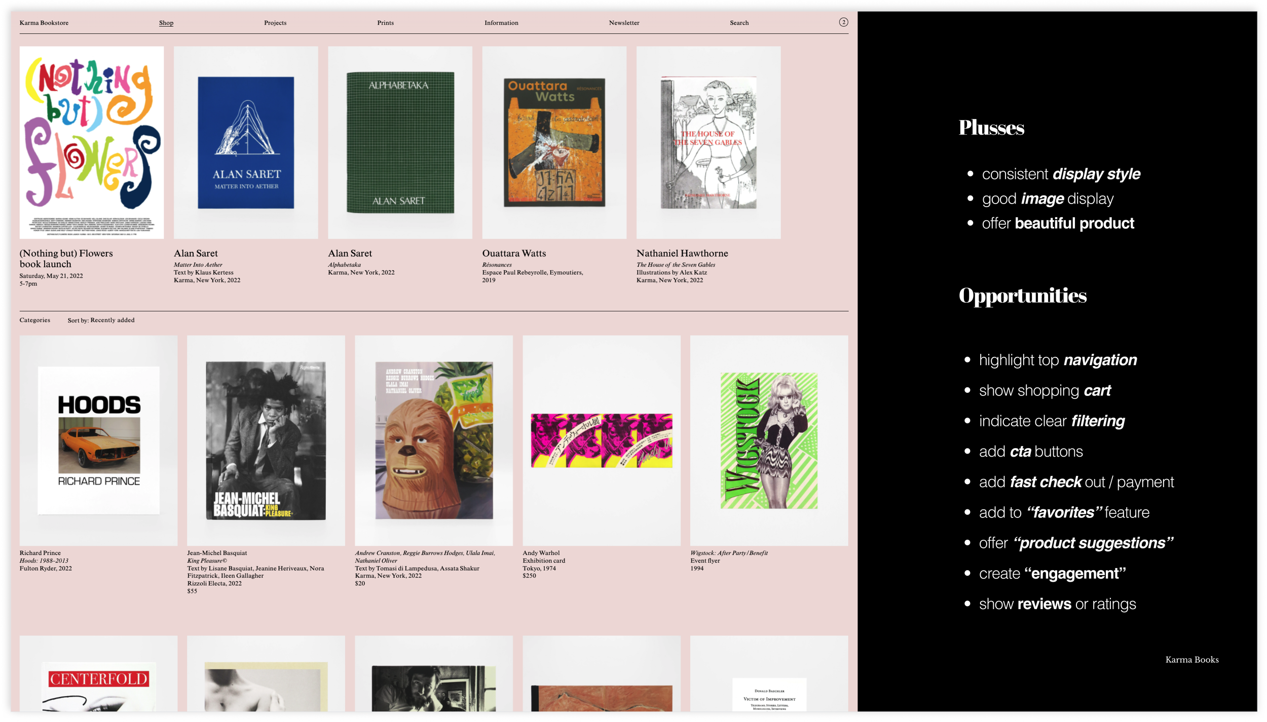
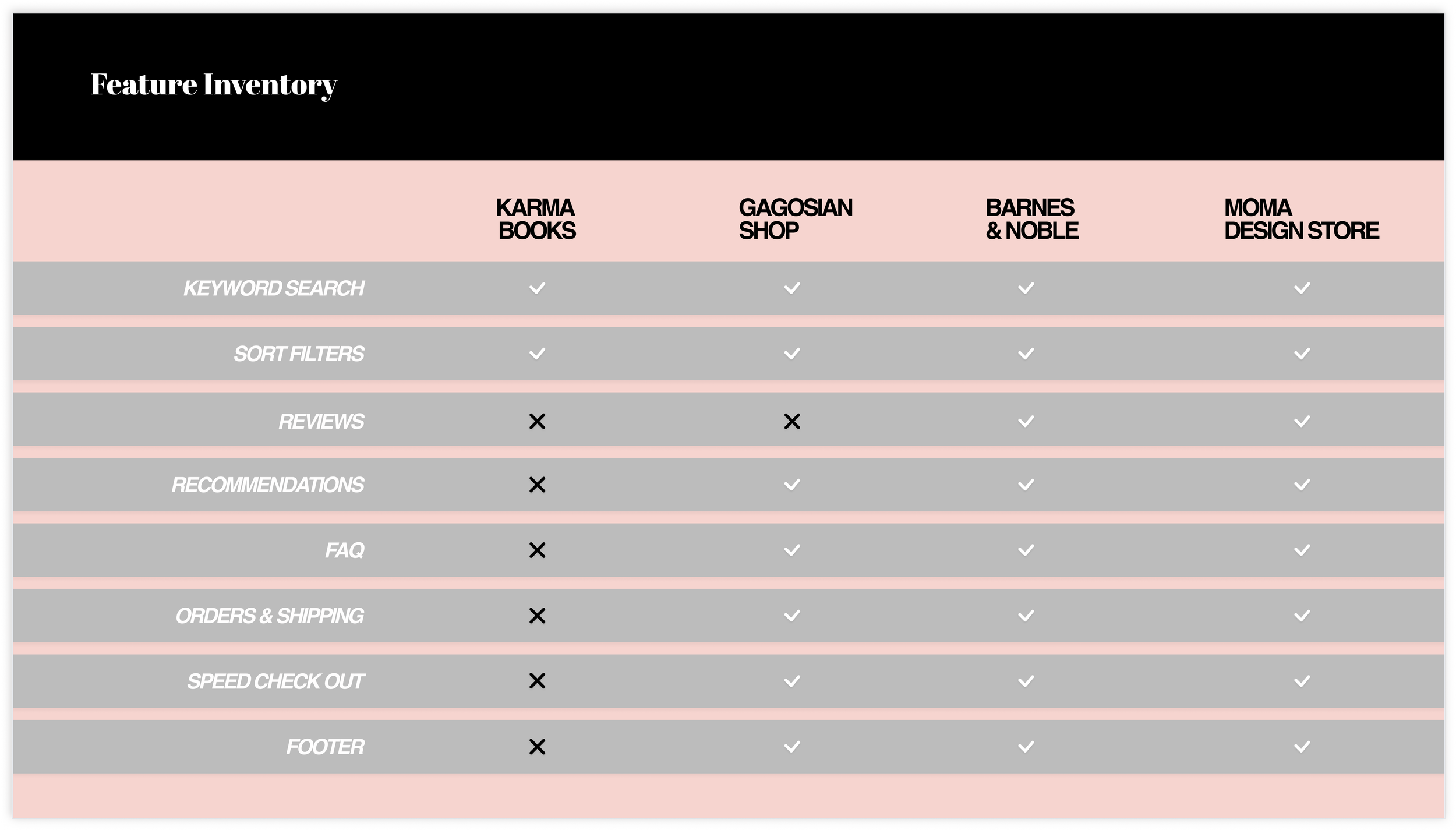
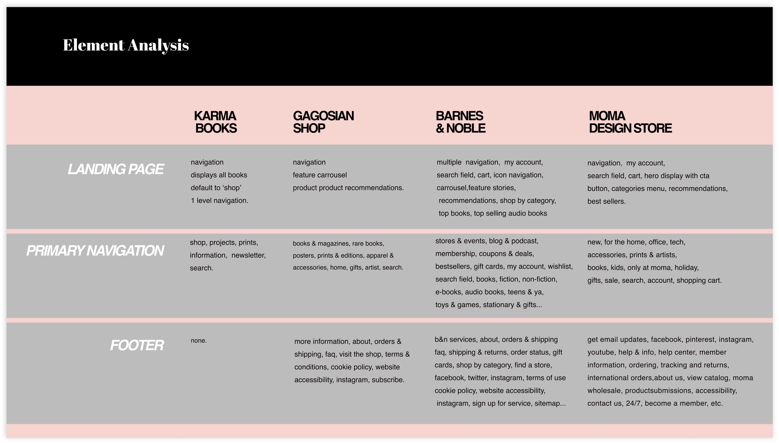
MARKET RESEARCH: ELEMENT ANALYSIS | FEATURE INVENTORY | PLUSES & DELTASGoal: to understand the market by doing a comparative analysis of Karma Books and 3 different competitors, each with unique characteristics.
Gagosian Shop, an important art gallery book store in NYC
MOMA Design Store, a museum book store offering books, design items, and gifts
Barnes & Noble, a household name offering books of all kinds, however not focused on art books
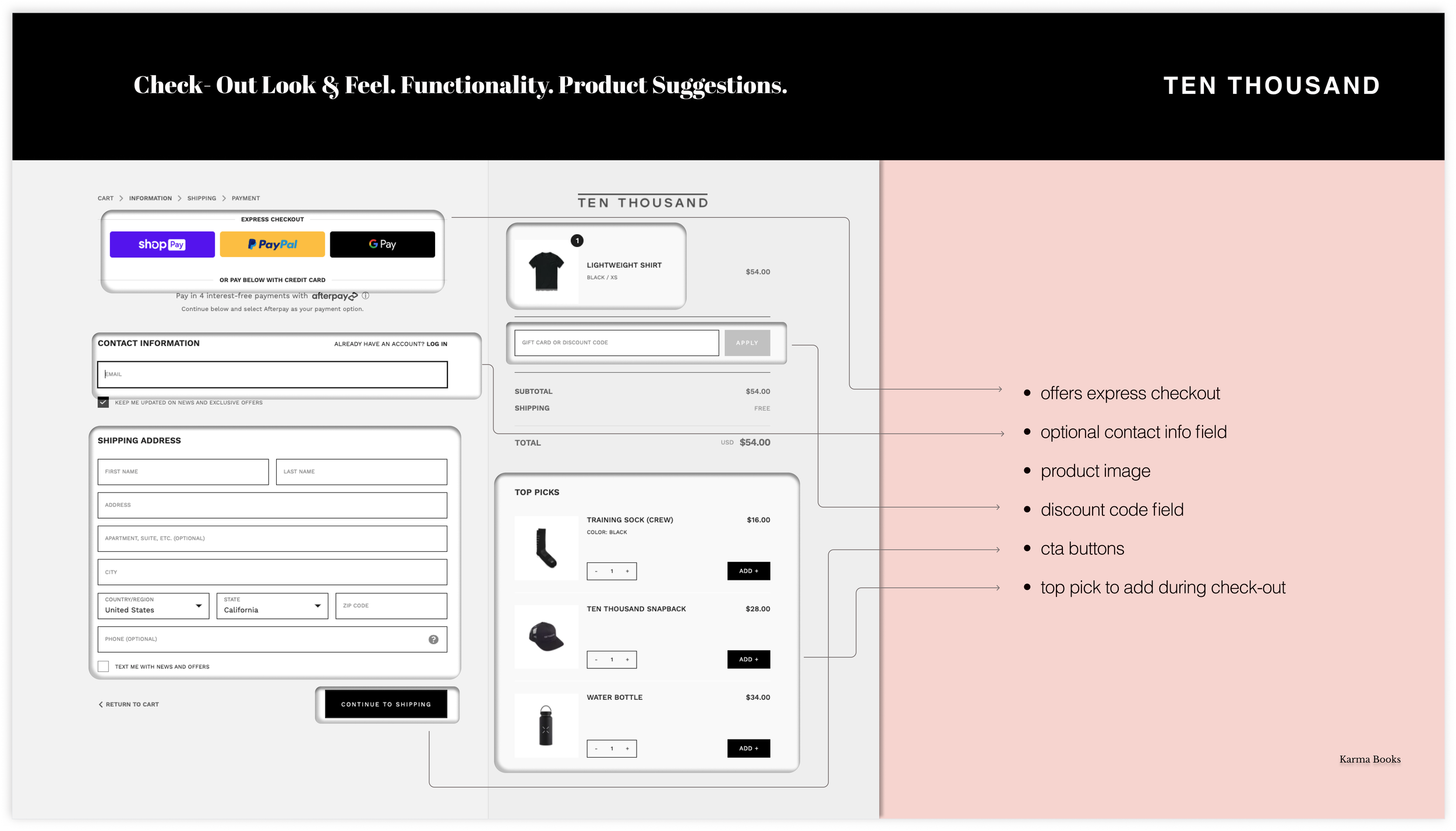
I also looked at some comparators for visual display, check out process and product suggestions: Feit, Ten Thousand and Rains
Gallery below: Competitive Analysis
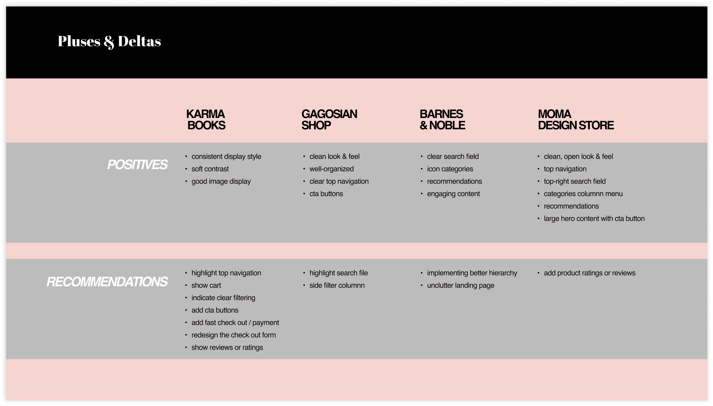
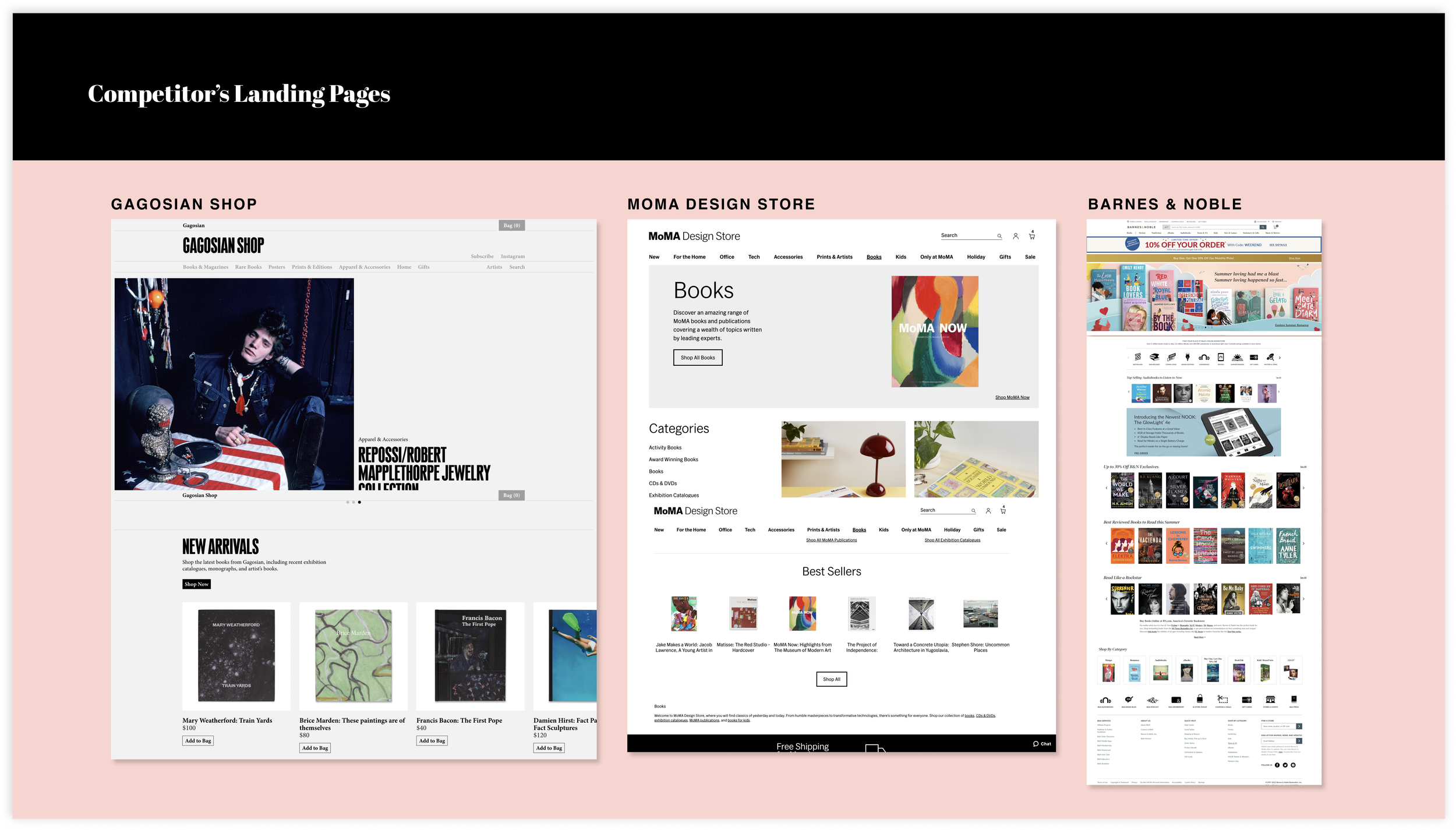
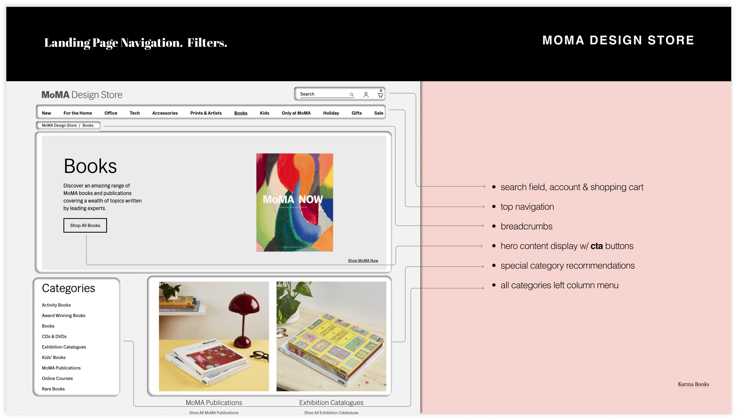
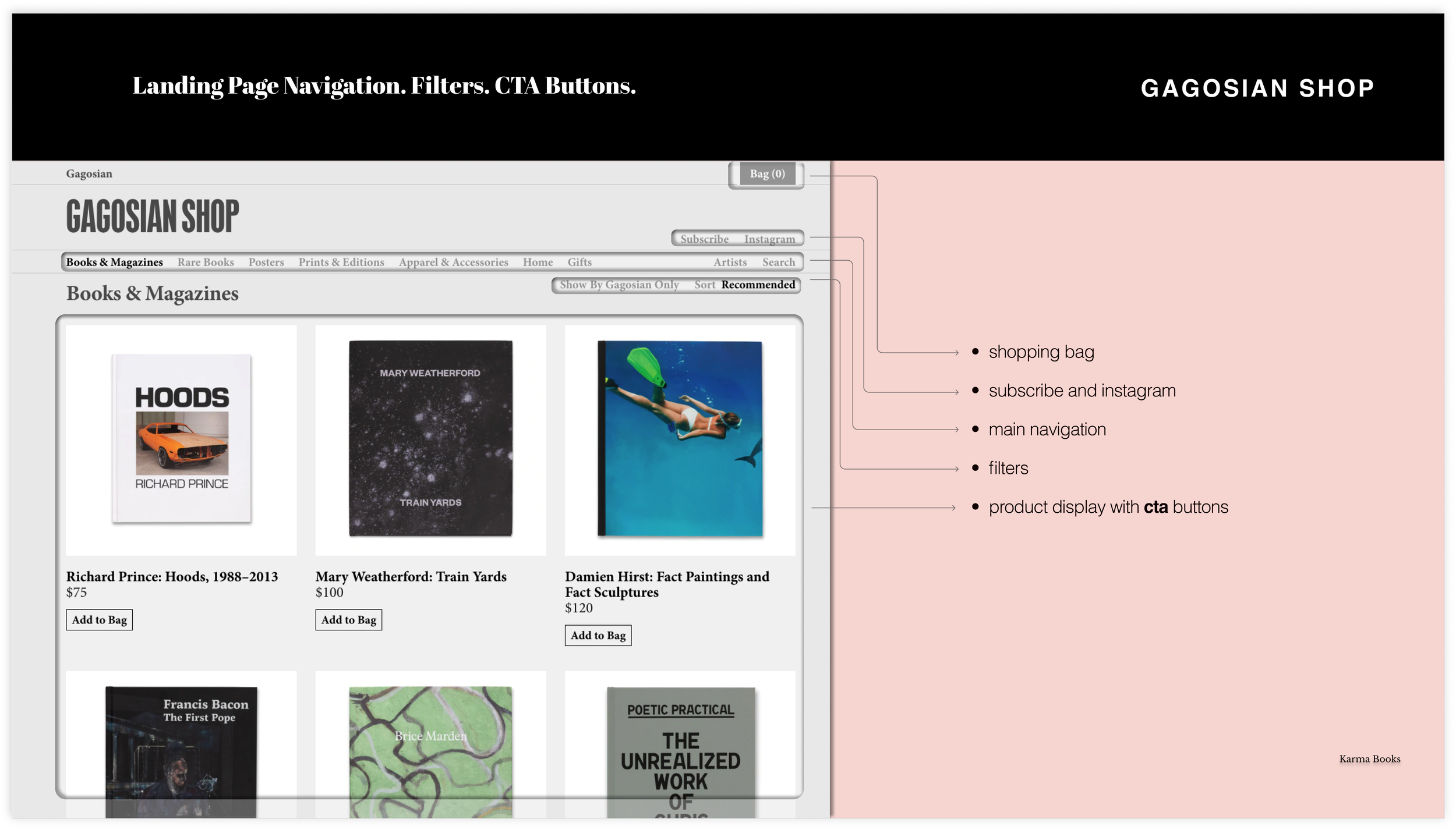
CUSTOMER RESEARCH: USER INTERVIEWS & AFFINITY MAPPINGSynthesizing my customer research, I could define two customer mindsets: The Savvy Shopper & The Experience Seeker. My solution aims to satisfy both.
Interview Questions:
Could you tell me what makes a great online shopping experience for you?
Do you think reviews are helpful when deciding about an online purchase?
What are some things that make you come back to an online seller?
What makes you trust and online seller?
Could you tell me about a few things that make you leave or ignore a certain site when you are shopping online?
Users expect convenience, ease of use, and value. But, a delightful experience with a brand builds customer loyalty.
Click below for Affinity Mapping
DISCOVER & EMPHATIZE | PERSONA | THE EXPERIENCE SEEKER DISCOVER & EMPHATIZE | USER JOURNEY | CURRENT USER FLOW Click on image to expand
Click on images to expand
Users are a bit confused navigating the current site
Users like the selection but find the site difficult to navigate
They would feel a higher level of trust if they could see other customer reviews
They find the check-out process lengthy, they wish Fast Pay was an option
They think shipping costs are a bit too high compared to larger retailers
There are no product suggestions at check-out , or an option to keep shopping
SYNTHESIZE & DEFINE: USER PROBLEM“I need to buy some well-rated books for my collection. I’d like to find a curated shop that is well-organized, and easy to shop. Not only that, but I hope they offer fast pay too!”.
- Leonardo.
Aim to exceed user’s expectations
How might we help Leonardo have a better user experience navigating the site?
How might we make him trust the website and become a long-term customer?
How might we help him select books faster and, check out quickly so that he could get on with his day?
IDEATION: NEW INFORMATON ARCHITECTURE AND EASIER NAVIGATIONUsing Card Sorting, I designed a new information architecture to make clear product categories
Added a Search field next to global navigation
Highlighted global navigation
Show shopping cart
Added clear, easy-to-find filtering system
Added the option to favorite an item
Click on images to expand
DIVERGE | DESIGNI hand-sketched, then moved on to low, mid, and high-fidelity digital iterations.
Goals: better engagement, easy navigation, a filtering system, product reviews, faster check out and product recommendations.
LANDING PAGE | NAVIGATION | ENGAGING CONTENT SECTIONSECTION PAGE | FILTERING SYSTEM | READER'S RATINGSMODAL QUICK PRODUCT VIEW | CAROUOSEL | ADD TO CART PROMPTMODAL CONFIRMATION | PRODUCT SUGGESTIONSSHOPPING CART S | RECOMMENDATIONS | FAST CHECK OUT *THESE MID-FIDELITY WIREFRAMES REFLECT USER TESTING FEEDBACK:
CONVERGE | PROTOTYPE & TESTFinal Screens & Prototype
*HIGH -FIDELITY SCREENS REFLECT FEEDBACK FROM A FINAL ROUND OF USER TESTING
Click below for Prototype
Click below x All Boards
STARTING A DESIGN SYSTEM


